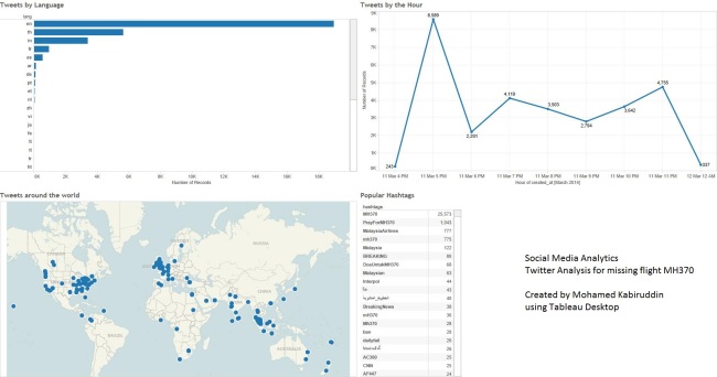
This post shows a quick twitter analysis dashboard that I created using Tableau Desktop. This dashboard is built on a dataset that was extracted from Twitter today (12 March 2014). This is a sample dataset that was extracted for the search term “MH370”. (Click on the image for enlarged size)
What story does this dashboard tell us? What analysis can be drawn out of this sample visualisation? Here are some of the observations I could immediately draw from this dashboard.
1. Maximum tweets are in English language followed by Thai (which is obvious and evident from the top left part).
2. There has been a steep increase in tweets between 4 – 5 PM and when I drilled down to the details / content in tweets, I found out that this was the time when some of the popular news channels published their breaking news on twitter. This exponentially grew in numbers as more and more people retweeted the breaking news.
3. I could hover over the map and find out which country / city had higher tweets than others and what patterns of tweets (texts / content) were coming from different parts of the world.
4. Finally, the maximum tweets had the hashtag “MH370” followed by “PrayForMH370”.
This sample exercise was done to simply leverage the capabilities of Tableau to analyse social media data from Twitter. The result is evidently a visualisation of meaningful information from raw tweets on a given topic.

